Flexbox reference
Credit: Thanks to this CSS Tricks article for the illustrations.
What is Flexbox?
Flexbox is a one-dimensional layout model for CSS that lets you control the alignment of items along a single dimension (horizontal or vertical) as well as the distribution of space between them.
Key terms
| Term | Description |
| Flex container | Parent HTML element that has display: flex. |
| Flex child | Any elements that are nested inside a flex container. |
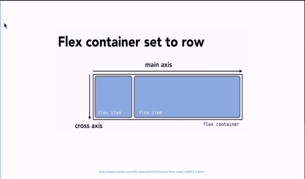
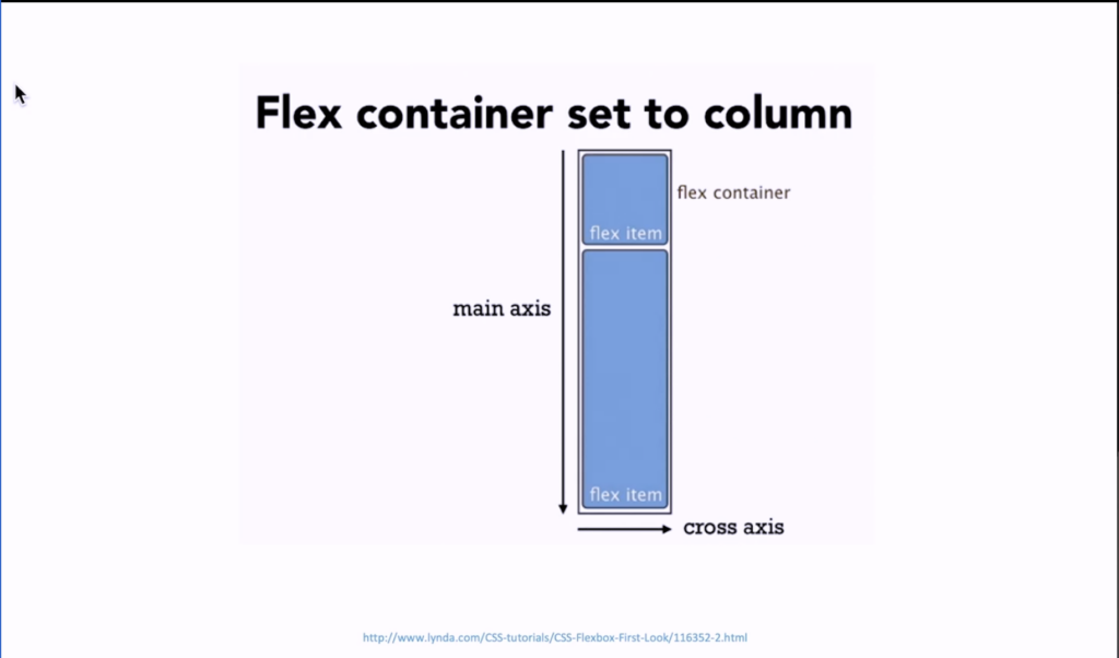
| Main axis | The direction of a flex container (set by flex-direction: row | row-reverse | column | column-reverse). |
| Cross axis | The alternate direction to the main axis. If main axis is column, cross axis is row; if main axis is row, cross axis is column. |
Main axis vs cross-axis
The behaviour of the flexbox model is heavily dependent on the values of the main and cross-axis.
Main axis
The main axis is set by the flex-direction property and can be one of four values:
row(default): left to right (assuming the writing mode is left to right)row-reverse: right to left (assuming the writing mode is left to right)column: top to bottomcolumn-reverse: bottom to top
Cross axis
The cross-axis runs perpendicular to the main axis. So, if the main axis is row, the cross-axis is column; if the main axis is column, the cross-axis is row; if the main axis is row-reverse, the cross-axis is column-reverse, and so on.
Flex container properties
display
Used to define an element as a flex container, establishing a flex context for all its children.
.container {
  display: flex | inline-flex;
}
Initial value: block or span depending on the HTML element.
flex-direction
Sets the main axis, thus establishing the direction that flex items are placed in the container (horizontal or vertical).

.container {
  flex-direction: row | row-reverse | column | column-reverse;
}row(default): flex container’s main axis is the same as the text direction (ltr, rtl, or auto).row-reverse: flex container’s main axis the opposite of the text direction.column: flex container’s main axis is the same as the block axis.column-reverse: flex container’s main axis is the opposite of the block axis.
flex-wrap
Specifies whether flex items should wrap onto multiple lines.

.container {
  flex-wrap: nowrap | wrap | wrap-reverse;
}nowrap(default): flex items will be forced onto one line (may cause the flex container to overflow).wrap: flex items will break onto multiple lines, from top to bottom.wrap-reverse: flex items break into multiple lines, from bottom to top.
flex-flow
Shorthand for flex-direction and flex-wrap.
.container {
  flex-flow: <flex-direction> <flex-wrap>
}
Initial value is row nowrap.
justify-content
Controls how items should be distributed along the main axis, including the distribution of space between and around them.

flex-start(default): items are packed toward the start of theflex-direction.flex-end: items are packed toward the end of theflex-direction.start: items are packed toward the start of thewriting-modedirection.end: items are packed toward the end of thewriting-modedirection.center: items are centred along the main axis.space-between: items are evenly distributed along the main axis. The first item is on themain-startedge; the last item is on themain-endedge.space-around: items are evenly distributed along the main axis. The space between each pair of adjacent items is the same. The space before the first item and the space after the last item is half the space between each pair of adjacent items.space-evenly: items are evenly distributed along the main axis. The space between each pair of adjacent items, the main-start edge and the first item, and the main-end edge and the last item, are all exactly the same.
align-items
Controls the alignment of flex items on the cross-axis (equivalent to setting the align-self value on all direct children of the flex container).

flex-start/start/self-start: items are flushed to the start of the cross-axis. The difference between these values is whether they respect theflex-directionorwriting-moderules.stretch(default): stretch flex items to fill the container (still respect width and height constraints).flex-end/end/self-end: items are flushed to the end of the cross-axis. The difference between these values is whether they respect the flex-direction or writing-mode rules.- center: items are centred along the cross-axis.
stretch: stretch flex items to fill the container (still respect width and height constraints).baseline: items are aligned so that their flex container baselines align.
.container {
  align-items: flex-start | stretch | flex-end | ...
}
align-content
Controls the alignment of the flex container’s lines on the cross-axis when there are multiple lines. This only takes effect for multi-line flex containers where flex-wrap is set to wrap or wrap-reverse.

.container {
  align-content: flex-start | flex-end | center | ...
}normal(default): items are packed in their default position as if noalign-contentvalue was set.flex-start/start: items are packed to the start of the container.flex-startuses theflex-directionwhilestartuses thewriting-modedirection.flex-end/end: items are packed to the end of the container.flex-enduses theflex-directionwhile end uses thewriting-modedirection.center: lines are centred along the cross-axis.space-between: the space between each adjacent line is the same. The first line is flushed to the start of the container while the last one is flushed to the end.space-around: the space between each pair of adjacent lines is the same. The space before the first line and the space after the last line is half the space between each pair of adjacent lines.space-evenly: the space between each pair of adjacent lines, the main-start edge and the first line, and the main-end edge and the last line, are all exactly the same.stretch: lines stretch to fill the remaining space.
gap
Sets a minimum gutter between flex items.
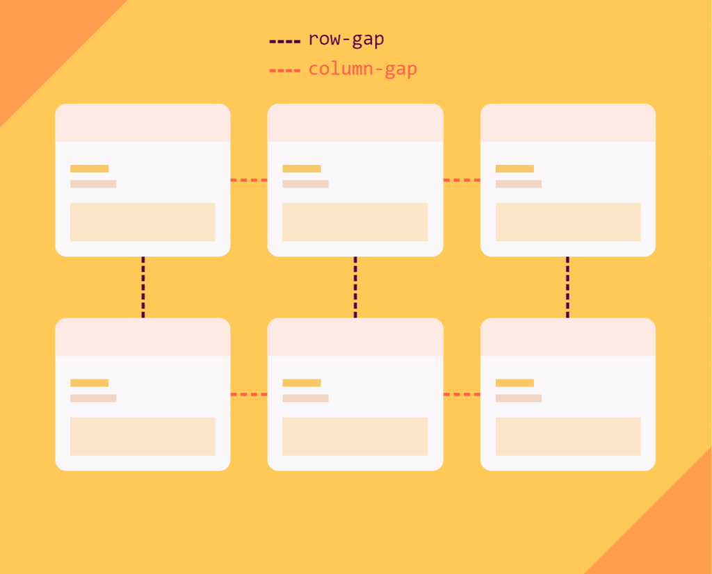
.container {
  display: flex;
  ...
  gap: 10px;
  gap: 10px 20px; /* row-gap column gap */
  row-gap: 10px;
  column-gap: 20px;
}
Values can be specified as a length (px, rem, em) or as a percentage.
Flex item properties
order
Controls the order in which a flex item should appear within a flex container. By default, flex items appear in the order they’re defined in the HTML.

.item {
  order: 3; /* default is 0 */
}
flex-grow
Controls how much of any remaining space of the flex container an item should take up. Value is specified as a proportion.
For example, if there are three flex items with flex-grow: 1 and there is 300px of free space within the flex container, then each item will take up 100px (300px / 3) of the free space.
If there are two items with flex-grow: 1 and one item with flex-grow: 2, 25% of the space will be assigned to the two items with flex-grow: 1 and 50% to the item with flex-grow: 2 (see illustration below).
Default value is 0 which means flex items won’t grow to take up any remaining space within the flex container.

.item {
  flex-grow: 3; /* default 0 */
}
flex-shrink
Specifies how a flex item should shrink if necessary (when the size of all the flex items is larger than the flex container) in proportion to sibling items. The value is a proportion so the higher the value, the more the item will shrink in proportion to sibling items. The default value 1 means all flex items will shrink equally.
.item {
  flex-shrink: 2; /* default 1 */
}
flex-basis
Sets the initial size of the flex item.
Value can be a length (px, rem, em), a percentage of the parent flex container, or auto (equivalent to the width if flex-direction is row or height if flex-direction is column).
If flex-basis is set to anything other than auto, and the item has a width or height specified, flex-basis takes priority.
.item {
  flex-basis: auto; /* default auto */
}
flex
Shorthand for flex-grow, flex-shrink, and flex-basis.
/* Three values: flex-grow | flex-shrink | flex-basis */
flex: 2 2 10%;

/* One value, unitless number: flex-grow
flex-basis is then equal to 0. */
flex: 2;

/* One value, width/height: flex-basis */
flex: 10em;
flex: 30%;
flex: min-content;

/* Two values: flex-grow | flex-basis */
flex: 1 30px;

/* Two values: flex-grow | flex-shrink */
flex: 2 2;
align-self
Defines the alignment for the individual flex item along the cross-axis. This overrides the default alignment or the one set by the parent flex container via align-items.

.item {
  align-self: flex-start | flex-end | center | ...
}
Other notes
- Flexbox stands for “Flexible boxes”.
- Spec was first defined around 2008 / 2009.
- Good for vertical centring and equal heights.
- Easy to reorder boxes.
- Wasn’t originally designed for layouts.
- Well-supported in all modern browsers, except for IE (which is deprecated anyway).
- By default, flex items are as wide as their content.